The pride of my trip to Japan no doubt has to be the 12 jersey collection I brought home with me. Here is a quick rundown of each of the jerseys, a little background behind each, and what I think of it. I’m gonna cover them in the order that I got them, so that puts the Giants jersey a little later, even though that was the first game I went to.
Jersey #1 - Orix Buffaloes
The genesis of the Jersey Project began on a ridiculously sunny day outside Skymark Stadium. As you may or may not remember, I collect fitted, official baseball caps at each of the MLB stadiums I go to, so I was looking for something similar to collect at the Japanese parks. Unfortunately, neither of the two teams I’d seen had fitted caps. I had initially ruled out jerseys in the states because I knew how expensive they ran, but then I noticed that the Buffaloes jerseys they had for sale in their outdoor stalls were only ¥3500 (about $40 at the exchange rate I suffered). That was only $10 more than I was used to spending on caps in America!
[caption id="" align=“aligncenter” width=“375” caption=“My first NPB jersey!”] 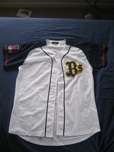 [/caption]
It’s a pretty nice jersey and after I tossed it on in the ballpark I was certain that I’d made a good souvenir choice. The B’s on the front and the Orix patch on the left are both legitimate, sewn on patches. It’s a pretty sharp color scheme too. The white contrasts very nicely with the dark blue and the red/yellow trim around the sleeves and patches looks pretty good. All that said, it’s still kind of a generic jersey. There’s no team name, no city name, no prominent company name. I like it, but the other, more creative jerseys just look better.
Rank: 8 of 12. Solid, but just too generic.
Jersey #2 - Hiroshima Toyo Carp
Hiroshima is a city that’s really dear to my heart. Of all the places I visited in Japan, it left the most lasting effect on me, both from the team spirit and the indomitable spirit of the people who rebuilt the city with vigor. Beyond all that, the team’s most prominent color is red and, to quote Andy Bernard, my blood runs Big Red. Housed in Mazda Stadium, a brand new ballpark with all the amenities, the Carp had one of the more robust team stores filled to the brim with red from boxer shorts (complete with catcher signs over the crotch) to the all-important jerseys and caps.
[caption id="" align=“aligncenter” width=“375” caption=“One of my favorite jerseys.”] 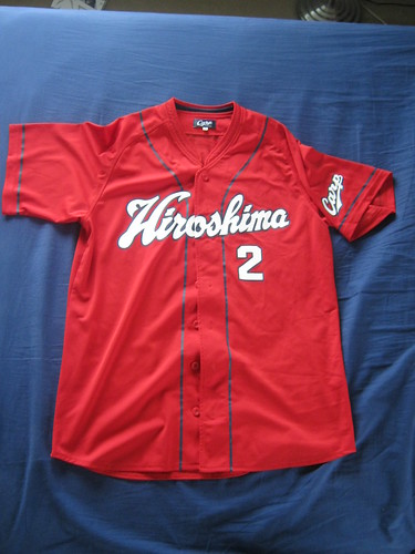 [/caption]
This time the jersey fetched a heftier fee, ringing up at around ¥5500, if I remember right, with the premium version selling for ¥6500. Concerned with saving money, I’m pretty sure I went with the cheaper edition of the jersey, which is kind of a shame now that I think about it. I’m not sure if the more expensive one actually had sewn on names (or even if the real jerseys do), but the names on the jersey are printed on and it lacks the ridges on the premium jersey. Despite all of that, the Carp jersey gets extra points from me for being red, quite fetching to look at, distinctly Japanese with Hiroshima printed across the front, and it features my favorite Japanese ballplayer, Akihiro Higashide.
[caption id="" align=“aligncenter” width=“375” caption=“This guy hit his 1000th hit with me in the stadium watching. I love this guy.”] 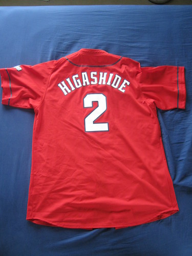 [/caption]
With all of these things going for it (and it being the jersey of my favorite team), one would expect it to top the bill, but I have to take some points away for its cheaper design and printed text. If it weren’t for those things, it would definitely rate higher.
Rank: 3 of 12. Ok, it doesn’t rank all that low, but still, it’s not #1!
Jersey #3 - Saitama Seibu Lions
You all remember how this jersey believes lions, right?
[caption id="" align=“aligncenter” width=“500” caption=“Makes me laugh every time…”] 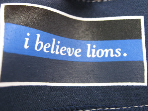 [/caption]
There’s one thing that the brand-conscious among you will notice right away upon viewing a picture of the jersey. I’ll give you a second to check it out…
[caption id="" align=“aligncenter” width=“375” caption=“Kind of plain, but made with nice material. What’s up with the armpits though?”] 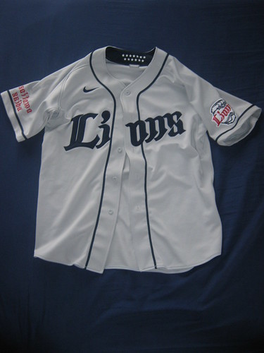 [/caption]
That’s right, the Lions are sponsored by none other than Nike, no doubt a deal that was penned (if it wasn’t already in place) following their victory in the Japan Series last year and, wouldn’t you know it, a brand-name jersey costs a lot more than the regular Joe editions pushed by the other teams. Already not a fan of the Lions because they play in the Pacific League in a strange quasi-dome, here I had to pay something like ¥7200 for this jersey. My little quest was starting to get quite expensive and I wasn’t happy about it.
Beyond that, there’s nothing really wrong with the jersey. It’s got a solid, old-school baseball look, but there’s not much to it beyond that. Grey is a terribly bland color (I suppose I could have bought white, but those were even plainer. There weren’t even blue highlights, if I remember correctly. The Saitama patch on the right arm and the Lions-ball-grasped-in-a-paw patch are both pretty generic looking too. The best feature is the “i believe lions,” but you can’t see that if the jersey is buttoned up or even in normal wear. All of that pales in comparison to the bizarre underarm of the jersey. For some godforsaken reason, the jersey does not have full armpits. Instead there are these vents, I guess to help get air to the underarm. I always wear an undershirt, but with these little vents exposing my armpits to the world, this jersey kind of forces the point.
Rank: 7 of 12. What’s up with the armpits on this thing?
Jersey #4 - Tokyo Yakult Swallows
By the time I showed up at Meiji Jingu for the Swallows game, I’d already seen the team play once. Counting that day, I was to see them play three more games. If you’ve been reading the blog, you know that I’m not a fan of this team, but they’ve actually got one of the nicer jerseys that I picked up.
[caption id="" align=“aligncenter” width=“375” caption=“That top red button really sells it for me.”] 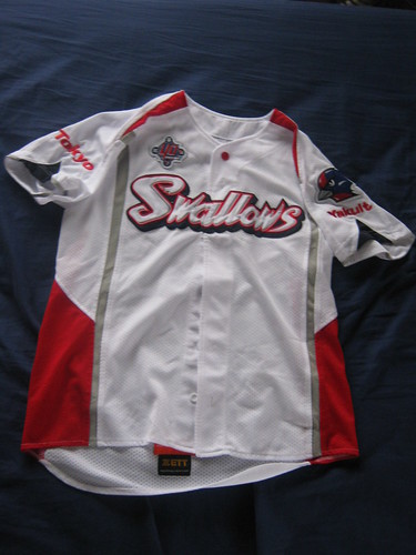 [/caption]
The Swallows have a jersey that’s just different enough from the MLB sets that it really sells the whole “Hey, we play baseball in Japan, not America” thing. From the red accents on the side (can you tell I love red?) to the great patches on both the arms and above the team name, to the coup de grace, the red top button, it’s just a well-designed jersey. I don’t have the other buttons done, but they’re white, not red, which would normally annoy someone so obsessed with symmetry and patterns, but I love it in this case. It’s like the rising sun sits right at the top of the jersey. Best of all, the jersey returned to a more reasonable price. I don’t remember how much I paid for it, but it was definitely between ¥4000 and ¥5000. I still can’t believe how much I paid for a Lions jersey that doesn’t even have a marketable player’s name on the back.
Rank: 5 of 12. It’s the Rising Sun on my jersey!
Jersey #5 - Yomiuri Giants
The Yankees of Japan. What team do I hate (fourth) most in the states? Which jersey do I loathe from my collection?
[caption id="" align=“aligncenter” width=“375” caption=“This one hurt to buy.”] 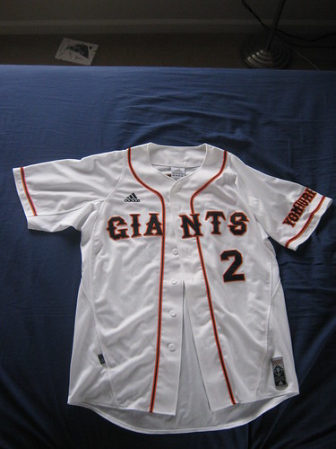 [/caption]
I’ll admit, this is a jersey I hate for completely non-aesthetic reasons. Aside from being rather plain, I am a fan of the orange and black on the jersey. Beyond that, there is one major reason why I hate this jersey. Make that 12000 reasons. That’s right, I had to pay ¥12000 to get this thing. Why?
1. They’re the Giants. The most popular team in Japan 2. It’s another name brand. Adidas
[caption id="" align=“aligncenter” width=“375” caption=“I don’t even know who this guy is…but he does have a great number.”] 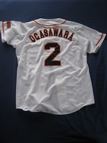 [/caption]
Since I didn’t know that I was collecting jerseys on this trip when we saw the Giants the first night, this one comes from the day Dave left and I went to Tokyo Disney Sea. I will say that I saw the jerseys in the store that night and thought they were far too expensive, but here I was, stuck buying the premium jersey. Why? I hear you ask. It’s because there are no non-premium jerseys. Pay less than ¥12000 and you can get a t-shirt that looks like a jersey, but you will never get a jersey. I bit the bullet and bought the thing, but I still get mad thinking about it.
Rank: 11 of 12. Sure, I’m being petty, but it’s my list and my criteria.
Jersey #6 - Fukuoka Softbank Hawks
After paying so much for my Giants jersey, prices became mostly trivial, so my dislike of the Hawks jersey comes not from paying between ¥6000 and ¥7000 for the thing, but more from an aesthetic dislike.
[caption id="" align=“aligncenter” width=“375” caption=“White jersey with yellow armbands. Way to break the creativity bank guys…”] 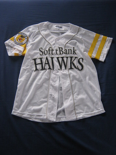 [/caption]
Uninspired and lazy is what I think when I see this jersey. The most creative part of it is the goofy-looking Hawk mascot on the right sleeve and we all know how I feel about that bird and his kin. Two yellow stripes? That’s the best you can come up with?
Worse, the Hawks are thinking of changing their jersey next year to be more like the BayStars. Just you wait until I get to that abomination…
Rank: 9 of 12. Stupid mascot and yellow bands.
Jersey #7 - Chunichi Dragons
It’s probably time to call me inconsistent, but I rather like the Dragons jersey. Maybe it’s the old-school look with the linked ‘C’ and ‘D’ or maybe it’s the delicious shade of blue that the team uses (it’s the closest to Cubs blue that I saw in Japan and I love me some Cubs blue), but I really like it.
[caption id="" align=“aligncenter” width=“375” caption=“It’s all about letter design.”] 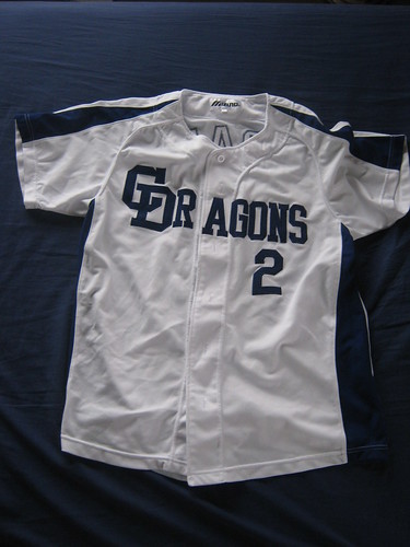 [/caption]
The player is pretty forgettable, but they don’t really sell Fukudome jerseys in the stadium anymore. I hear he’s a veteran who’s been playing a long time and he had a decent game, but he didn’t call out to me like Higashide or Toritani.
[caption id="" align=“aligncenter” width=“375” caption=“Araki is getting close to the end of his career, but I love his number and the fact that he plays second base.”] 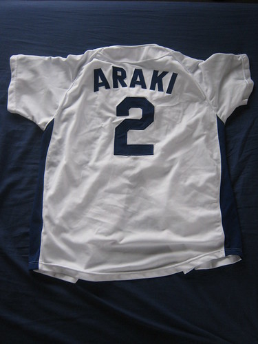 [/caption]
Beyond that, I like the wedge-shaped highlights on the sleeves and up the sides, but it’s a shame that the jersey doesn’t really have any patches.
Rank: 6 of 12. A solid effort, but the ones above it either have more sentimental value or sharper designs..
Jersey #8 - Hanshin Tigers
This is a jersey done right. Everything about it just exudes tight design. Pinstripes are a staple of baseball while the black and yellow interact fantastically everywhere they’re paired together.
[caption id="" align=“aligncenter” width=“375” caption=“Sharp.”] 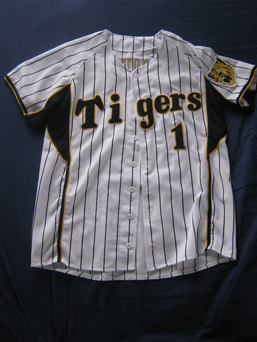 [/caption]
Even the textures are nice on this sucker, with everything sewn on and a ridged surface, it’s also really nice to feel. Check out that fierce Tiger patch. Scary.
[caption id="" align=“aligncenter” width=“375” caption=“Toritani! My second favorite Japanese baseball player.”] 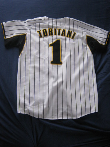 [/caption]
I almost unintentionally ended up falling in love with numbers and players that were part of the middle infield. While I’ve got a few pitchers thrown in there (and a first baseman), I’m pretty sure most of the jerseys I own with names belong to the middle infield. If that’s not supported by the data, then my favorite ones do, so can it. Takeshi Toritani is a fine shortstop and he was a clutch performer in the games that I saw.
Rank: 2 of 12. The highest ranked “traditional” jersey, this guy just gets it in all the right places. Pinstripes, black accents, yellow trim, and a badass tiger.
Jersey #9 - Hokkaidō Nippon-Ham Fighters
Back-to-back superstar jerseys. The Nippon-Ham I bought has everything going for it that you’d want in a Japanese jersey. How’s about a quick peek before we go over all the highlights.
[caption id="" align=“aligncenter” width=“375” caption=“Worth it just to see the faces as they read Nippon-Ham”] 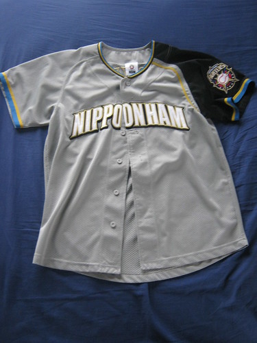 [/caption]
Sure, Fighters jerseys fetch about ¥9000, but you really get what you pay for in this case. When the Fighters moved to Sapporo (they used to play in Tokyo and share the Dome with the Giants) they totally revamped their image and went with this completely non-traditional look. The most glaring difference is the left sleeve. Beyond the nifty, sewn-on patch, it’s an entirely different color from the rest of the jersey (this is the case for the home, away, and interleague versions of the jersey too). That bold accent, coupled with the hilarious Nippon-Ham adorning the front already seal the deal on this being my favorite jersey, but the best part is the player I got.
[caption id="" align=“aligncenter” width=“375” caption=“I was so close to seeing Darvish pitch…”] 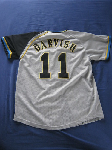 [/caption]
Yu Darvish is a superstar. No other pitcher in Japan approaches how great this guy is right now. He was hurt for most of the season, but he even came out to pitch in Game 2 of the Japan Series while hurt. Instead of pitching to his usual velocity, the guy just relied on curveballs and other tricky pitches and still only gave up two runs on one home run. The guy’s a stud on the mound. I really hope he comes to pitch in the states one day.
Rank: 1 of 12. Darvish + the off-color arm = win
Jersey #10 - Yokohama Baystars
From first to absolute worst. I don’t even know where to start with this guy…
[caption id="" align=“aligncenter” width=“375” caption=“Worst. Jersey. Ever.”] 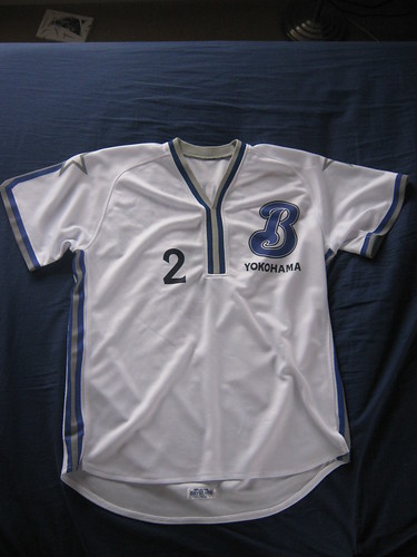 [/caption]
Oh wait, how about the fact that its NOT EVEN A JERSEY! The traditional jersey has buttons. There are no buttons on this jersey. Everything on it is printed, even the cheesy stars on the shoulders that, I kid you not, I did not notice until two minutes before I wrote this sentence. Everything about this jersey screams forgettable.
[caption id="" align=“aligncenter” width=“375” caption=“Is he any good? Who would know on this team.”] 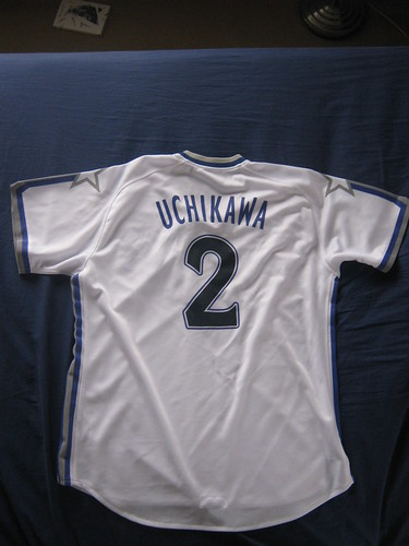 [/caption]
At the very least Uchikawa is pretty good. He led the league in 2008 in batting average, but, beyond that, I couldn’t care less. He plays for a garbage team.
Rank 12 of 12. I’m so glad I only had to pay ¥4000 for this thing. It’s not even a jersey!
Jersey #10 - Chiba Lotte Marines
When I first saw these jerseys I thought they looked kind of cool. The different colors and zig-zag of the sleeves look kind of cool from far away, but something about this jersey soured me to the idea not long after I got it.
[caption id="" align=“aligncenter” width=“375” caption=“What kind of a jersey sponsor is The Hartford?”] 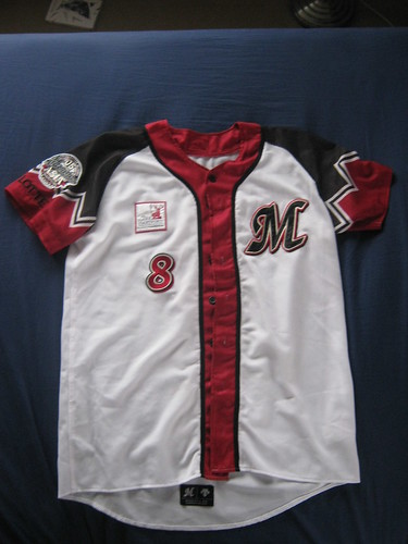 [/caption]
When you look closely at the jersey, the most bizarre thing pops out at you. They prominently display the logo of The Hartford. An investment firm on a baseball jersey? Just doesn’t feel right.
[caption id="" align=“aligncenter” width=“375” caption=“I think I have more corner infielders than middle. Oh well, I still like the middle fielders more.”] 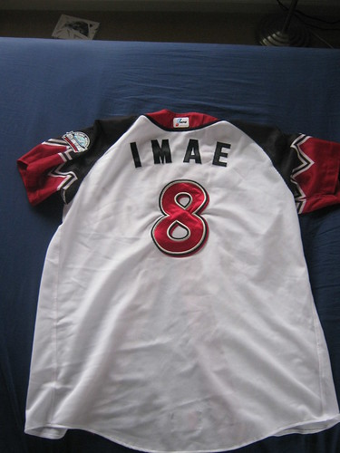 [/caption]
I know I’m being nitpicky here, but I don’t really like the design they chose for the numbers on the jersey. I also don’t like that it cost me ¥11000 and it doesn’t fit all that well.
Rank: 10 of 12. I can’t explain precisely why I don’t like it, but it’s not that great.
Jersey #12 - Tohoku Rakuten Golden Eagles
I was really pulling for the Eagles to make it to the Japan series this year. After seeing them battle back and beat the Hawks with a grand slam and watching Masahiro Tanaka turn in a stellar pitching performance, the team became my favorite in the Pacific League.
[caption id="" align=“aligncenter” width=“375” caption=“Check out the wings on the team name!”] 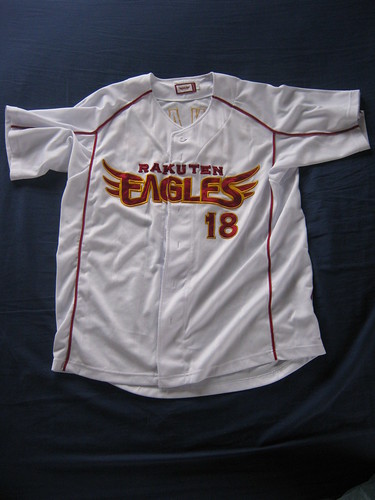 [/caption]
Beyond that, just look at what they did with a fairly simple jersey design. There are no fancy patches or color swatches, but they did do something neat with the logo on the jersey. Instead of going with the regal, refined look, they put freaking wings on the thing. It’s sweet.
[caption id="" align=“aligncenter” width=“375” caption=“Tanaka - my second favorite Japanese pitcher.”] 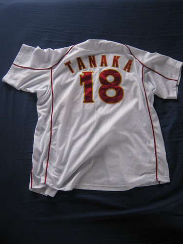 [/caption]
The plentiful red is always appreciated and so is Tanaka’s name. A fine jersey and one of the better teams I saw on the trip.
Rank: 4 of 12. Wingtips! On the name!
What do you think of the designs? Would you arrange them differently?